This past week, I have cheered on one after another of the wild weeds that were blooming in my February garden. Posted only two days ago, I ended the following video by saying:
“As soon as you see these things, you know that your garden is about to fully wake up.”
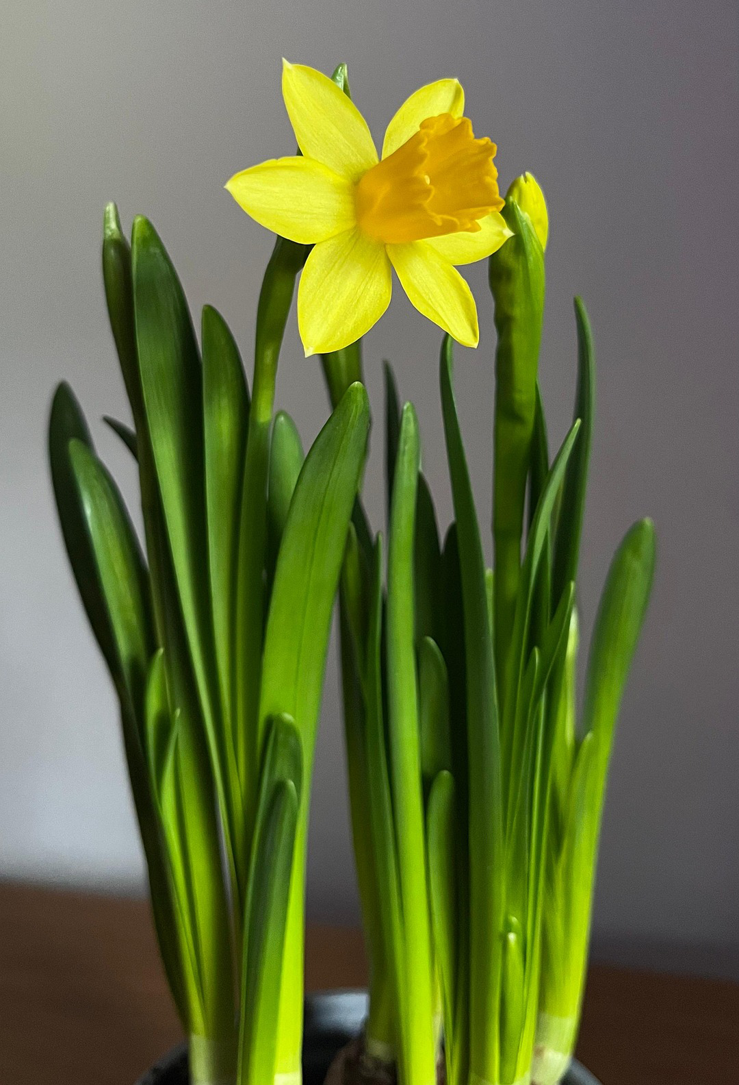
And as regular as clockwork, today, I saw the first daffodils of my year. My spirit rejoiced!
Last night, I was at a party, and I admitted to my friend that I am a perennial painter. I paint when things are blooming and growing in my yard. The rest of the year, I simply mark time. But that is all good now. It is almost March, and my painting time of year is full speed ahead.
This week, I am preparing my art students to begin to paint and draw daffodils. Invariably, they are the first things that I paint in my gardening year. A daffodil, however is a bit complex–it is essentially a combo of a lily and a tulip–with the tulip-like cup resting in a lily-like saucer.
Note that when the daffodil is looking directly at you, the petal are spaced like this:
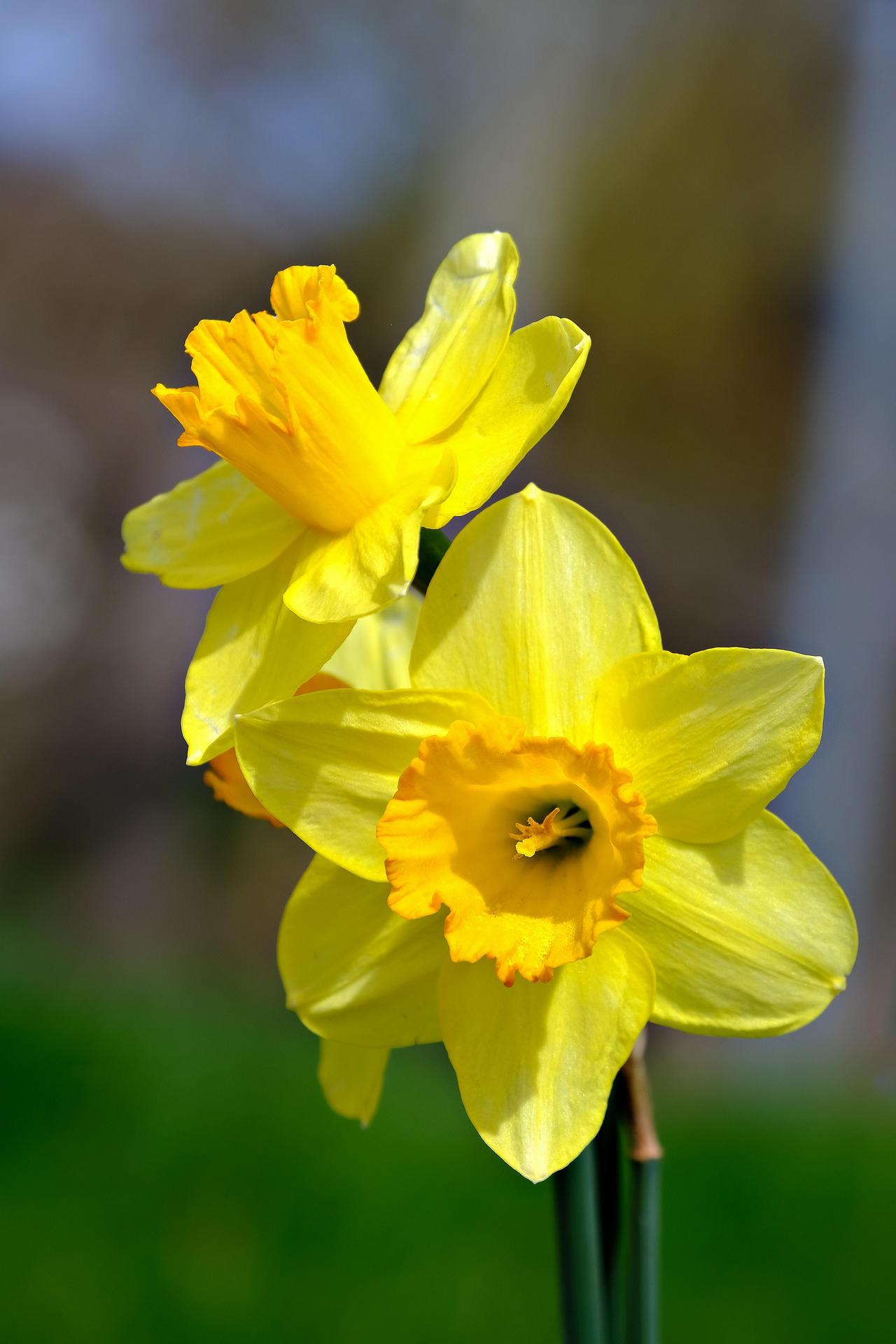
Each part of a daffodil bloom must be painted separately–after understandinng the lights and darks of each area:
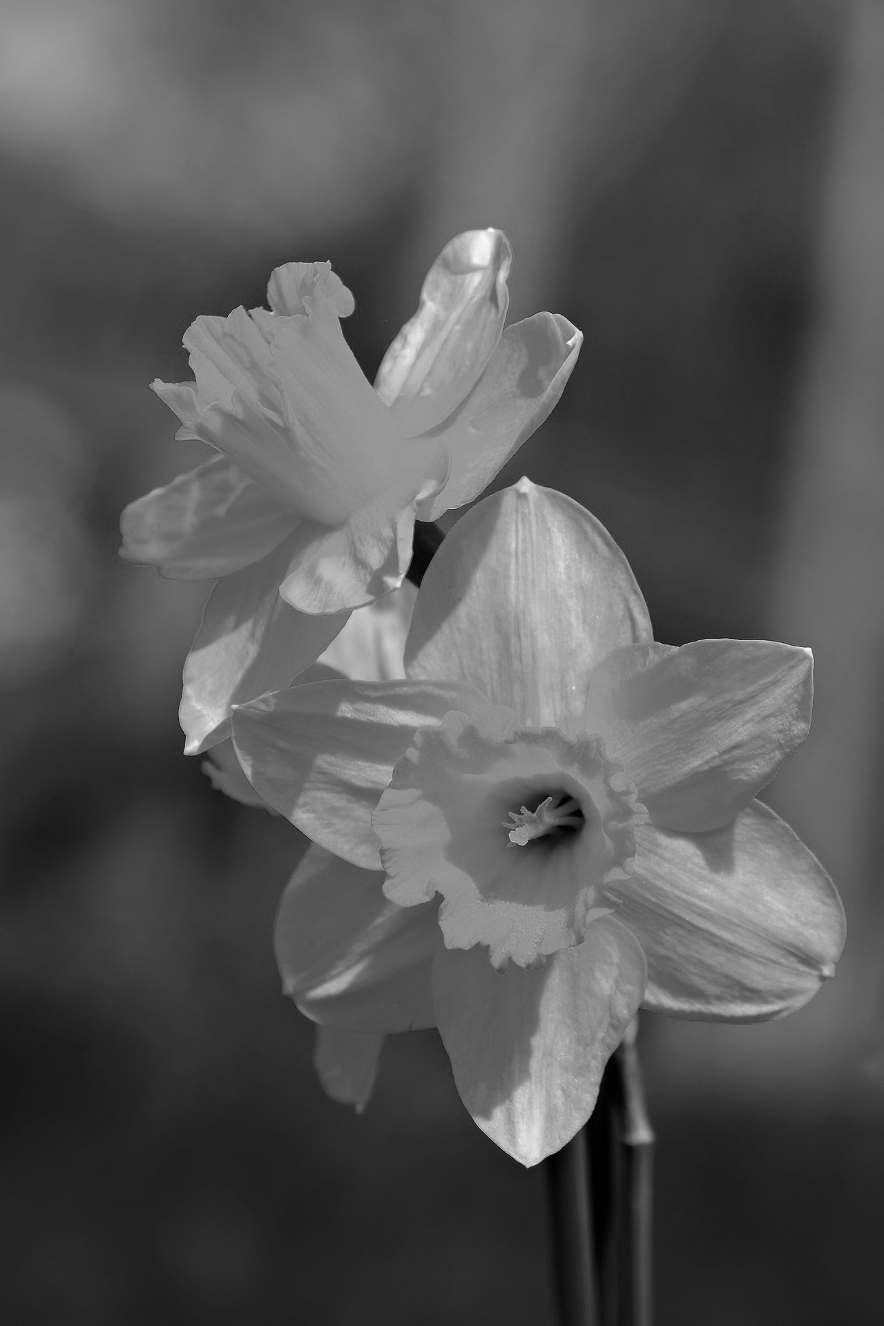
Let’s analyze one flower at a time:
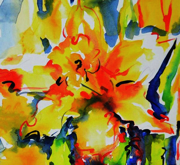
Daffodil Looking Up – Jacki Kellum Watercolor – Sold
No prints available at this time
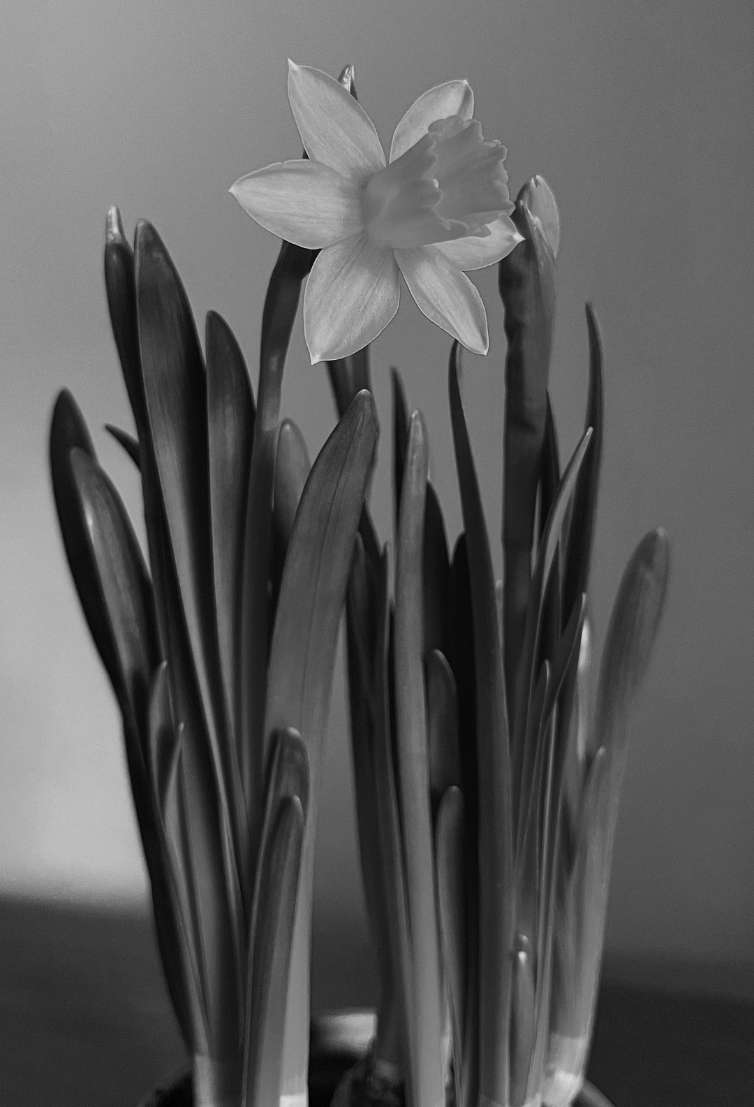
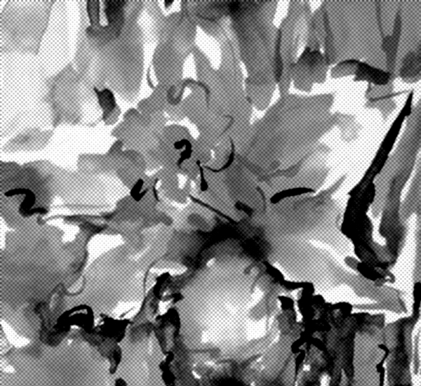
Although some daffodils are of multiple colors, the daffodil for Daffodil Looking Up is all one color — Yellow! Following is how a black and white rendition of my painting would appear:
= 
In my painting, the calligraphy work is part of the separation of shades of yellow–and it is also what gives my art its energy.
But before I reached the point that I could paint with abandon, I did about 1 bezillion.; drawings and painting studies. This week, I want you to try drawing daffodils–looking in every direction.
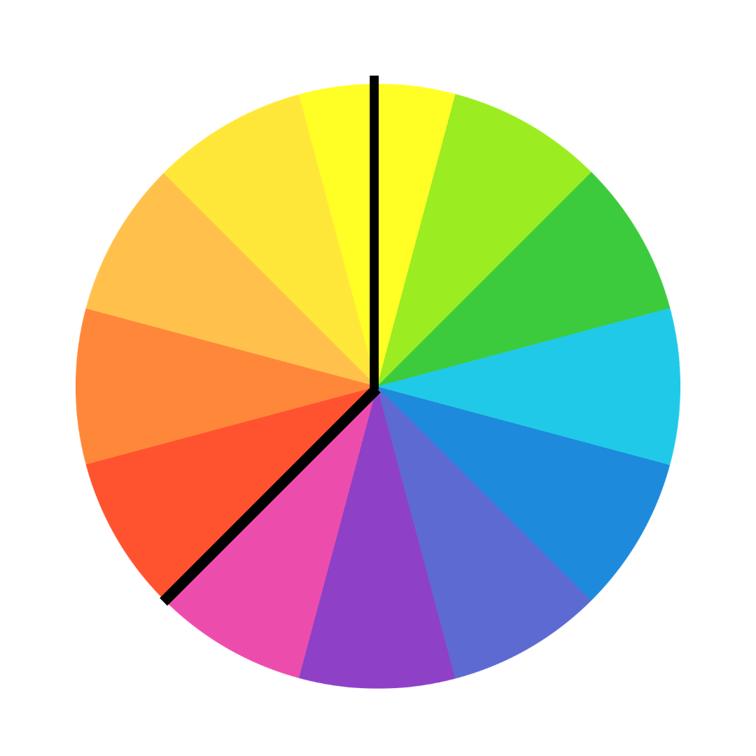
On the first day of class, I told my students that shading any color is a matter of moving around the color wheel from yellow toward violet. Yellow is the lightest color, and violet is the darkest.
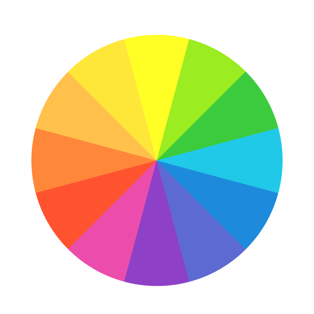
I created most of my painting Daffodil looking Up by moving from yellow to yellow orange to orange to red orange to red. Because yellow and violet are complements and mixed together, they nullify each other, I stopped shy of red violet. The dark calligraphy work is definition.
Discover more from Jacki Kellum
Subscribe to get the latest posts sent to your email.