In a systematic way, I am researching the wrting and illustrating career of Tomie dePaola. When I started this project, I was simply trying to think of a way to honor dePaola on his birthday–September 15.
The prolific picture book author and illustrator Tomie dePaola was born on September 15, 1934.
After I began my research of Tomie dePaola, I was stunned by the vast collection of illustrated books that dePaola has left the world–about 250 books. He has written and illustrated simple picture books, and he has written and illustrated collections of illustrated stories. I have ordered several of dePaola’s books–mainly because I wanted to study the ways that this master has woven his text with his images. In this post, I hope to show you some of what I discovered.
 Tomie dePaola – Strega Nona’s Harvest – 2009
Image Credit: Tomie dePaola on Amazon
The above page shows one of dePaola’s more standard ways to break up a longer bit of picture book text. There is text above the illustration and text below the illustration. The above illustration is a one-page illustration. Let’s look at a two page spread in Dan Santat’s picture book After the Fall.
 Image Credit: Dan Santat on Amazon
The above illustration is a two-page spread. Below, I have super-imposed a white rectangle that shows where the page would fold into a book. That area is called the book’s gutter.
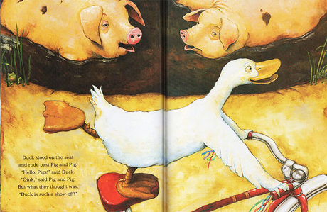
The above shows a two-page illustration from David Shannon’s Duck on a Bike. The gutter is where the two sides of an illustration meet and fold into the central binding. When you illustrate a picture book, it is necessary to plan for the area that is lost in the fold–or the gutter.
The following shows another one-page spread:

Tomie dePaola’s Mother Goose
Image Credit: Tomie dePaola on Amazon
Tomie dePaola has created several collections of stories and/or rhymes. The above illustration shows one way that dePaola framed a larger bit of text with four separate images arranged around the text to create a visual frame.

The upper part of the frame

The Right side of the frame

The Left side of the frame
Notice how the spiked cross and the spiked chimneys echo each other and how the windows do the same thing. This repetition of elements and the repetition of colors connect the two images–although they are separated by text,


The above is at the bottom of the frame.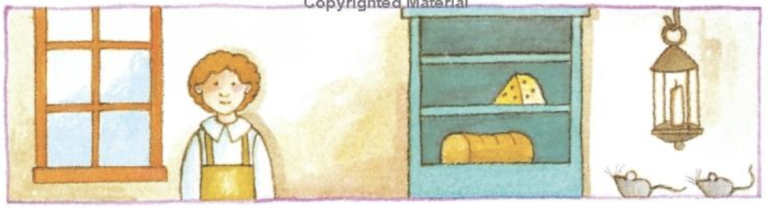
Notice how the colors of the top panel are repeated in the bottom.
Following is another page illustrated within a similar frame. Notice how the cloud mass in the top pagel is repeated — but in reverse on the bottom panel.
 Following is a single page filled with several images, but each image represents the texts of different rhymes. Yet, the repeated coloring holds all 3 sepatage rhymes together–to design a cohesive page:

Notice how each frame on the above page has a scene–with ground or sea at the bottom. The images below are separate images and separate rhymes on one page, but they have no frames and no ground for each of the rhymes. The separate images below hold together because of the ways that the colors and other elements are repeated:
 Image Credit: Tomie dePaola on Amazon
In the following page, there are several images to illustrate one ryme–one image per stanza. Notice that there is a more fully developed ground area for each image, but no frame is drawn around each. Notice the way that the images and text switch from left to right to create a weave of images.

The following page has two separate rhymes in two separate frames:

The following rhyme is illustrated with that same type of repeated but opposite design–almost symmetrical–design.
 Image Credit: Tomie dePaola on Amazon
Discover more from Jacki Kellum
Subscribe to get the latest posts sent to your email.