Color Mixtures
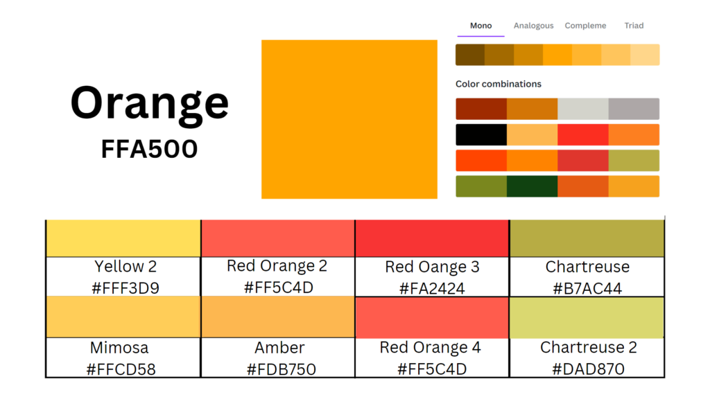
Goerschner mixed viridian green and orange to make chartreuse.
 |
|
Color Combinations of orange and chartreuse.
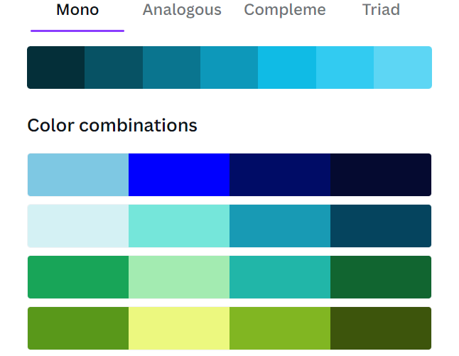
Goerschner often creates a triad by adding turquoise or blue green as the blue.
No doubt, Goerscher used viridian to create his green blue.
Goerschner relied on red oranges to add punch.
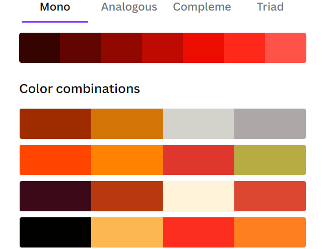
Complements of Red Orange

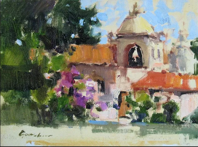
In Carmel Mission, Goerschner used red-orange color combos.

The red-orange color triad.
His painting of red barns are variations of red-orange. He creates the roof in a neutral mixture of red orange and green.
His list of complementary Combos:
- Ultramarine and Burnt Sienna
- Violet and Yellow Ochre
- Viridian and Cadmium Red Medium
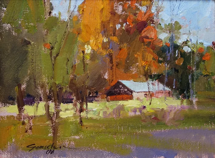
The above painting falls into Goerschner’s series of red-orange buildings. These are the colors he probably used:
- The warmer grass colors are a mixture of sap green, viridian, and cadmium orange.

In the above painting, he used a split complementary color scheme.
He often started with a yellow, and yellow’s complement is violet. But in a split complementary painting, he uses yellow with blue-violet and red-violet [the 2 colors on either side of violet].
Goerschner used a surprising amount of violet in his paintings.

He listed Manganese Violet as one of his palette colors.
To make a middle-value violet gray, Goerschner mixed cobalt blue, manganese violet, and white.
Ted Goerschner’s Palette
Earth Tones
- terra rosa
- burnt sienna
- raw sienna
- yellow ochre
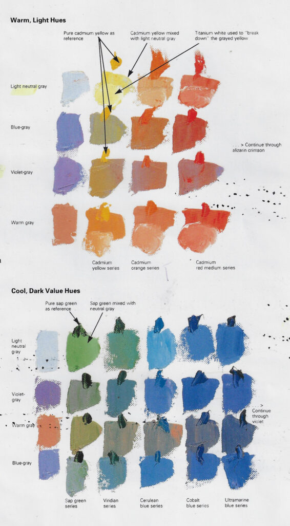
Spectrum Colors
- cadmium yellow light
- cadmium yellow medium
- cadmium orange
- cadmium red light
- cadmium red medium
- alizarin crimson
- manganese violet
- magenta
- ultramarine blue
- cobalt blue
- cerulean blue
- viridian
- sap green
Black and White
- ivory black
- titanium white
Grays
Middle-Value Blue Gray
- cobalt blue
- titanium white
- ivory black
Middle-Value Violet Gray
- cobalt blue
- manganese violet
- titanium white
- ivory black
Middle-Value Warm Gray
- cadmium orange
- cadmium red light
- burnt sienna
- ultramarine blue
- titanium white
Light-Value Neutral Gray
- burnt sienna
- ultramarine blue
- titanium white
Painting Tree Masses
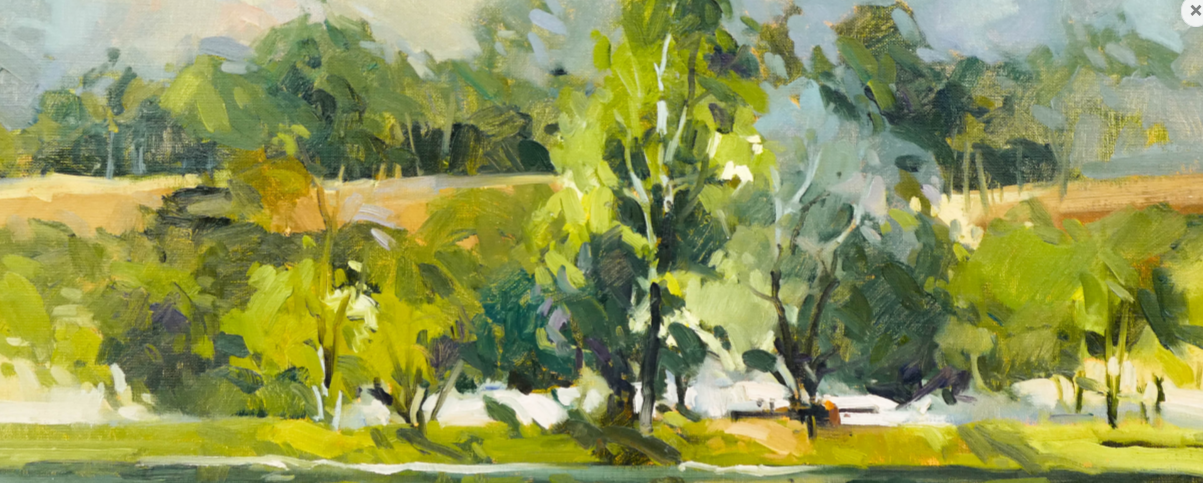
Brighter Greens
- For the brighter trees, he probably used Cadmium Yellow Light and Cadmium Yellow Medium in the lighter [non-whitened] areas. He also added white to those colors in areas
- He probably shaded the brighter trees with cobalt blue, ultramarine blue, and magenta.
Darker, More Subtle Greens
- The base green is viridian mixed with sap green,
- He shaded this area with the greens mixed with cadmium red.
In the following trees, complements are probably used to dull the greens.
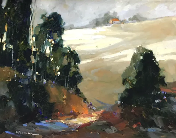

How to Paint Conifers on a Snowy Slope Tutorial I
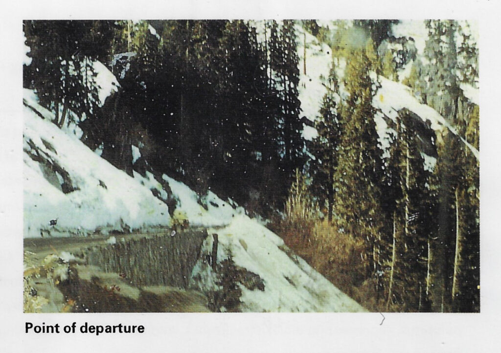
The photo of the scene is shown above.
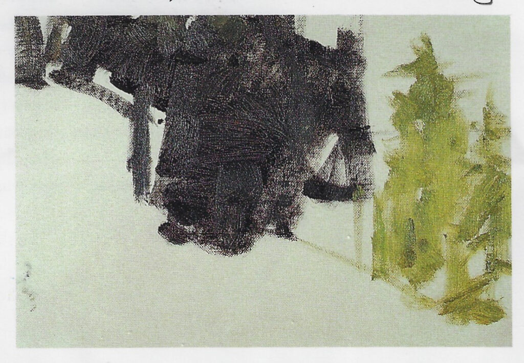
Step 1: Tone the Canvas with a Neutral Mixture of Violet-Gray.
- cobalt blue
- manganese violet
- ivory black?
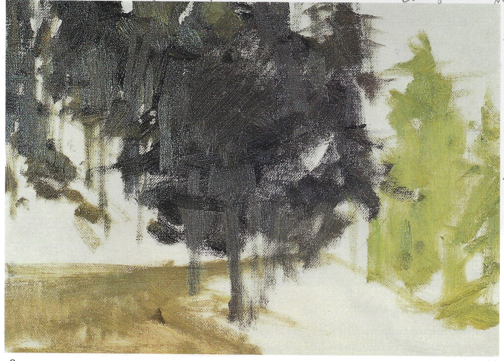
Step 2: More color for the main conifers – Add road.
The Chartreuse Conifer
- Naples yellow
- viridian
- sap green
The shadow under the chartreuse conifer is red-violet
Dark Green Conifers
- raw sienna
- viridian
- ultramarine blue
Road
- burnt sienna
- cobalt
- titanium white
- ivory black

Snow in Shade
- Blue-Gray Mix [cobalt, white, black]
- Ultramarine
- Cerulean at the brightest area
Light Tree Trunks Warm Gray
- cadmium orange
- cadmium red light
- burnt sienna
- ultramarine blue
- titanium white

How to paint from a photo Tutorial II

The insignificant photo is above
Step 1: Tone the canvas with thinned Venetian red and burnt sienna.
Step 1b: Mass-in the distant mountain range with violet-gray mud mixture:
- cobalt blue
- manganese violet
- ivory black?

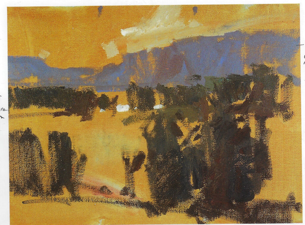
Begin by massing in the main shapes with interesting masses.
- cobalt blue
- manganese violet
- ivory black?
Mass in the distant tree line – Note the negative spaces:
- raw sienna
- viridian
Sky:
- cadmium orange
- burnt sienna
- ultramarine blue
- titanium white
Foreground trees
Darker Trees:
- sap green
- ultramarine blue

The fields are greens that become more yellow as they approach the foreground.
There is more violet and blue in the distance.
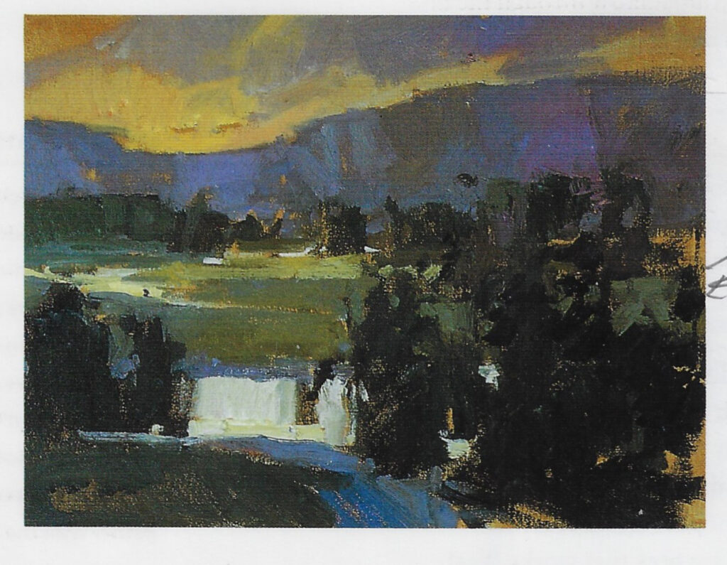
Refine the foreground trees. The area on the left is subordinate and is softer and calmer. The area on the right is more active and more distinctive.

Step 4:
The river with touches of white
The left of the purple mountains is more indistinct
The foreground shadows
- ultramarine blue
- violet
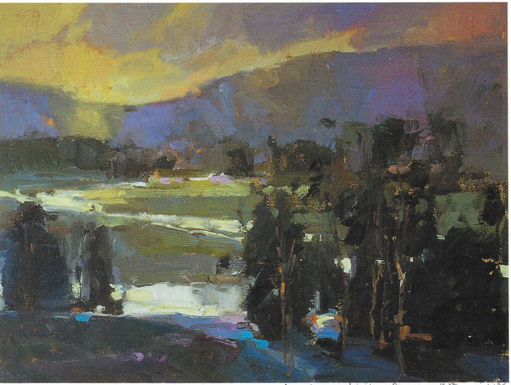
Step 5:
Dots of bright, broken color.
I feel sure that the bright light blue is cerulean.
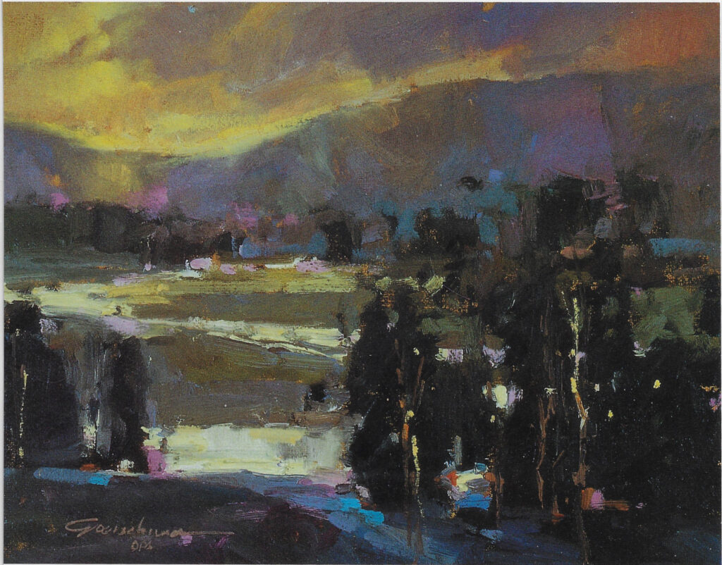
Snake River Idaho
“To interpret what we see before us, to distil its essence, to point out the wonder and omit the mundane, these are the greater truth that make up the artist’s long and honored tradition.” Goerschner, pg. 41.
Goerschner, Ted, and Lewis Barrett Lehrman. Oil Painting: The Workshop Experience. 6th ed., North Light Books, 2001.
Transcending Your Source Material – Tutorial III
“As an artist, I get to paint nature the way I feel it would be, not how it is or how my camera records it.” Goerschner, pg. 44.
He did not tone the canvas.
He sketched the scene with a mixture of sap green and ultramarine blue.
Step 2: Establish the light pattern
Thin the mixture and wash in the light area. Use mineral spirits to lift out lights on tree trunks.
Step 3: Add some color
The distant mountains are violet-gray:
- cobalt blue
- manganese violet
- ivory black?
- a tad of red-violet to accent the green trees
The atmospheric blue area beneath the mountains:
Add 2 mixtures of greens to the trees
The rich dark green
- viridian
- ultramarine blue
Dark Greens
- sap green
- ultramarine blue
The shadowed snow:
- cobalt blue
- white
More shade:
- violet – this area pulls your eye into the trees
The blue highlight
- cerulean blue
Tree trunks are warm gray:
- cadmium orange
- cadmium red light
- burnt sienna
- ultramarine blue
- titanium white
Pure white in light snow
The dominant area is the left. The subordinate area is the right.
Step 4: Save the point of interest for the last
The point of interest is the red house. The snow there is a bit more yellow. Very little detail.
Spots of broken color:
- orange
- white
- dots of sky color
Dark colors in the reflection
Mendocino Farm – Tutorial IV
Toned Canvas
He blocked in the buildings:
- white
- orange
- cerulean blue
- cobalt blue
- purple shadow
He added the trees behind:
- sap green
- ultramarine blue
- viridian
Although there are no mountains in the photo, he added a line of hills. He allowed dots of the hill colors to poke through the trees.
There is a cyan strip at the base of the hills
The trees are sharp around the focal point. They are fuzzier elsewhere.
He painted the sky,
He added yellow-green highlights.
He added Naples yellow around the houses.
House at Harmony – Tutorial V
Toned canvas.
Sketch with manganese violet and burnt sienna.
Step 2:
House Light Side:
- cadmium yellow
- white
House Shadow Side:
- cobalt blue
- manganese violet
- ivory black?
Right Tree Mass Light Side:
- sap green
- raw sienna
Right Tree Shadows Add:
- ultramarine blue
- magenta
Left Tree Mass Less Distinct and Darker
Distant Hills:
- viridian
- manganese violet
- white
Sky:
- cadmium orange
- burnt sienna
- ultramarine blue
- titanium white
Dabs of Color to Indicate Junk around the House & to Add Splash to the Center of Interest
Foreground Grass – Viridian +
Add Barn:
Weathered Tan with Warm Gray Roof
Warm Gray:
- cadmium orange
- cadmium red light
- burnt sienna
- ultramarine blue
- titanium white
Trees around the barn:
- viridian
- ultramarine
Foreground Light Side:
- cadmium yellow
- white
Shade this with a touch of manganese violet below the light.
Harmony Afternoon – Tutorial VI [Brighter – House Front in Shadow]
“Ignore what you see…Paint what works!” – Goerschner, pg. 68.
Toned canvas
Muddy violets + yellow ochre for shaded front of the white house.
Pure white on the light side.
Darkish tree mass behind the house
Greenish hills
Intense accents:
- cadmium red pure
- cadmium yellow pure
Sky:
- touch of cadmium orange and white
- touch of cobalt blue mixed with white
Foreground Shade
- manganese violet
- cadmium orange and viridian mix
Colorado Farm – Tutorial VII
Toned canvas
Block-in the focal point first. For white houses, block in the whites immediately.
Block-in the tree masses:
- sap green
- raw sienna
Less distinct trees:
- viridian
- ultramarine
Distant Hills:
- viridian
- manganese violet
- white
Space base of hills: a turquoisey blue violet
Greens around the main house
Cerulean blue near the focal point
Cadmium red splash next to that
Minty greens near the houses.
The foreground is dark violets – no detail. Draws attention to focal point.
Wiped in tree trunks almost last. Use turp to wipe out tree trunks.
Winter
Afternoon Sun – Detail
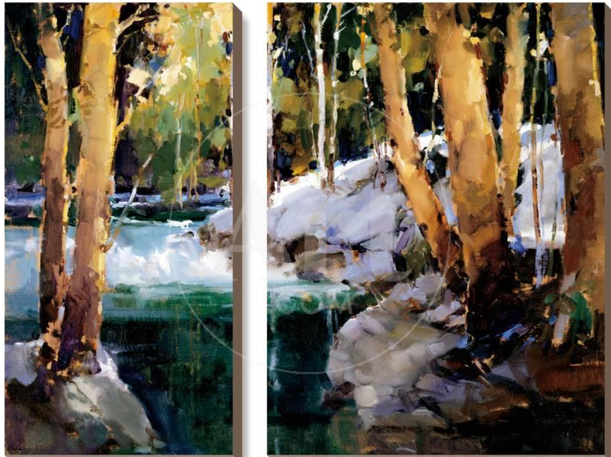
Afternoon Sun
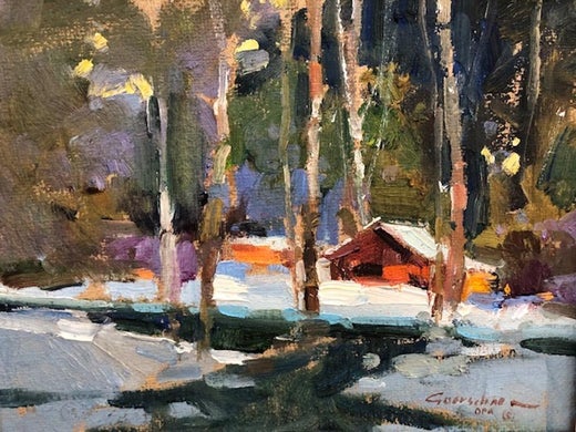
Winter Cottage
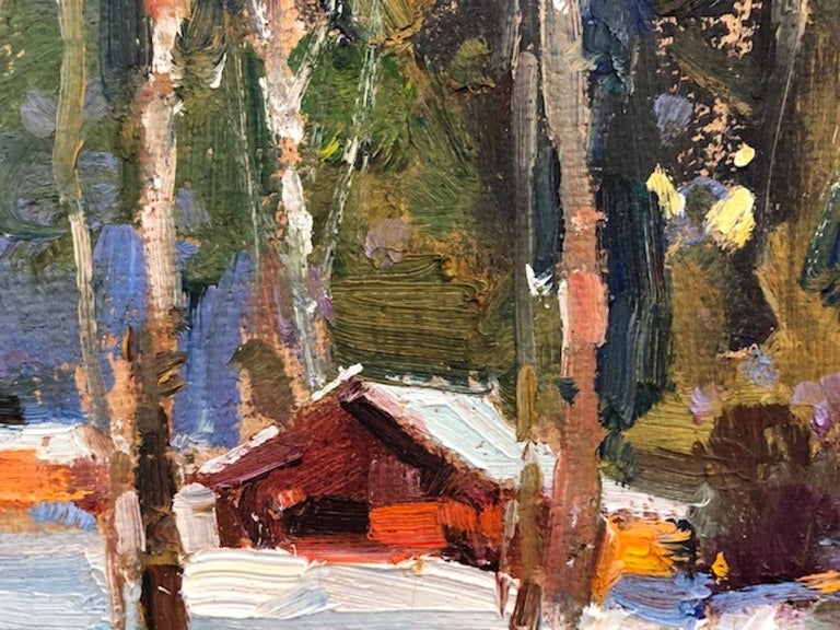
Detail
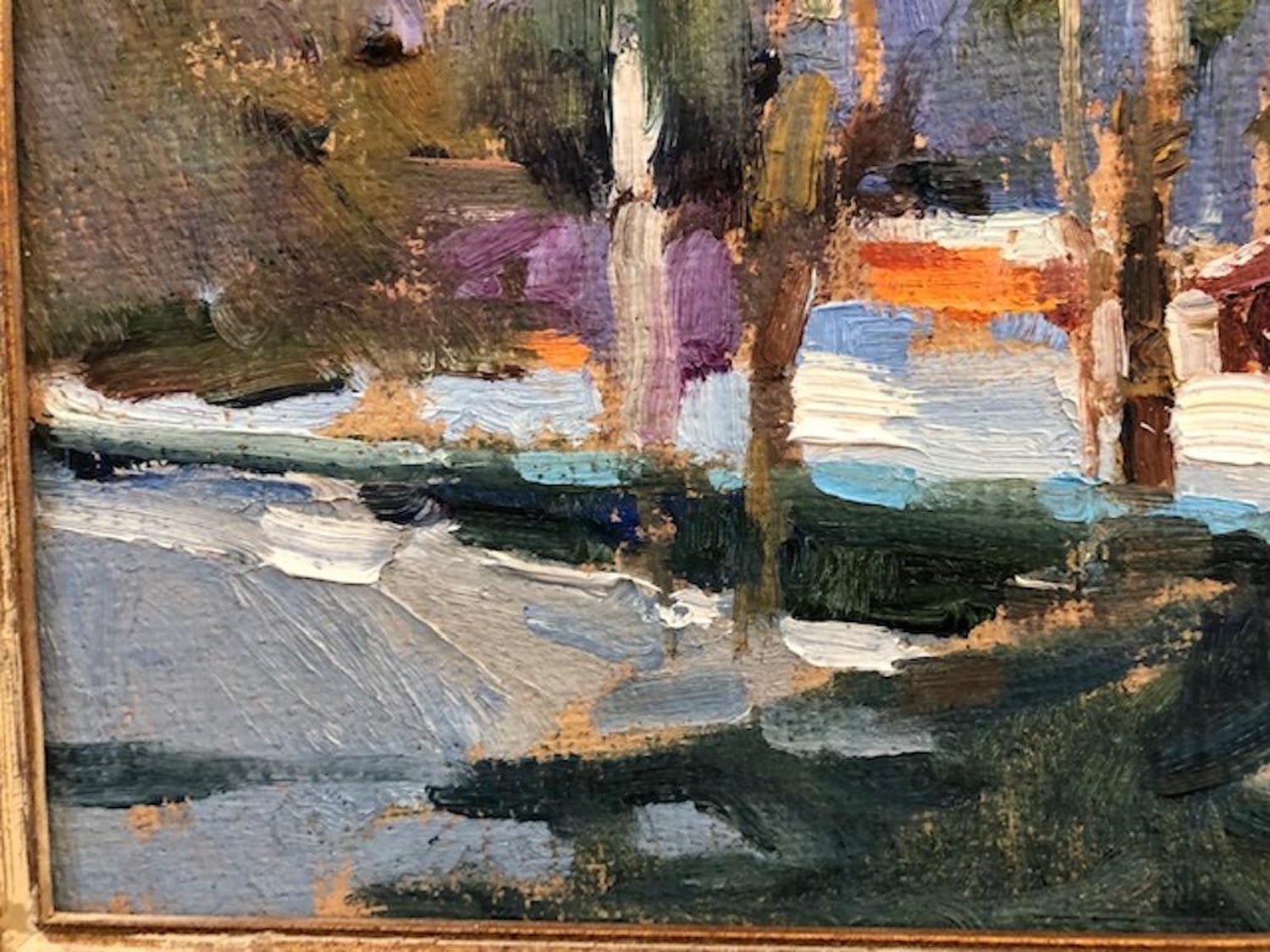
Detail
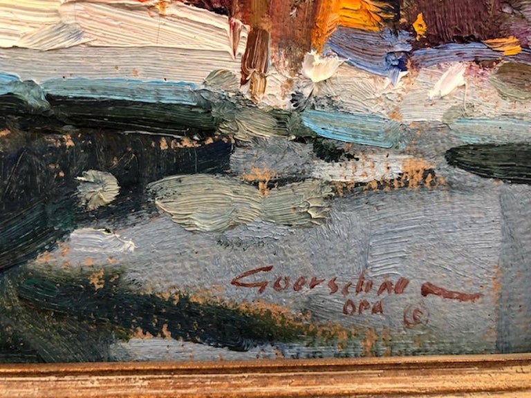
Detail

Morning Walk
Autumn 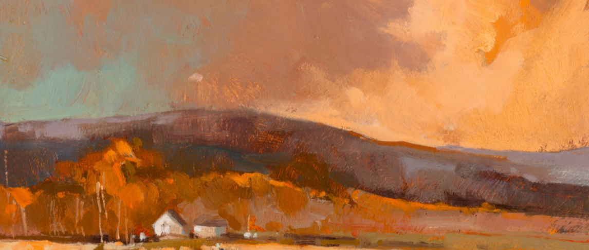
Earth’s True Gold
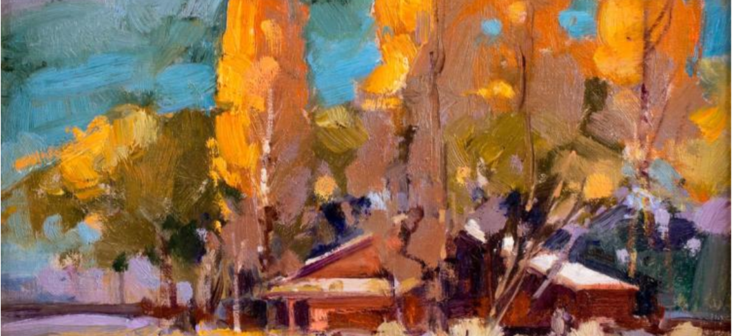
Hondo Valley

Lake Como View

Lake House
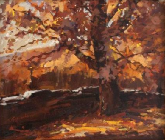
Autumn Landscape
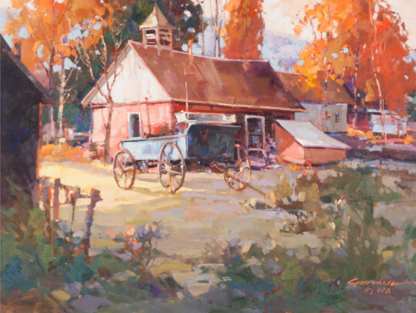
High Country Casita
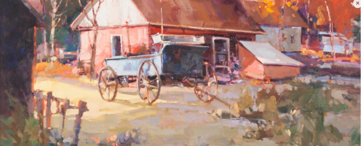
Detail
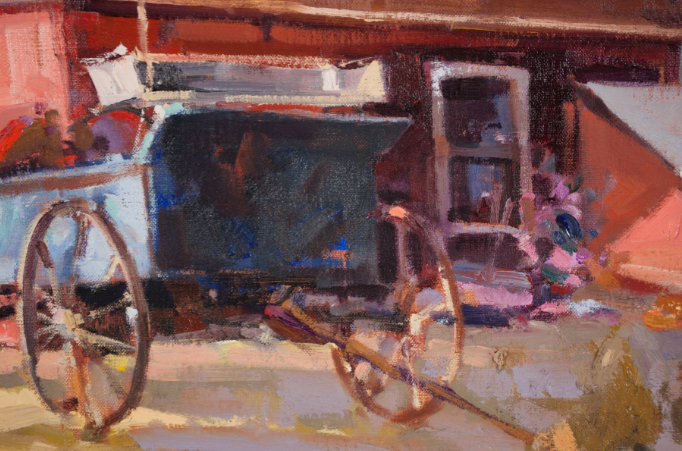
Detail

Country Landscape
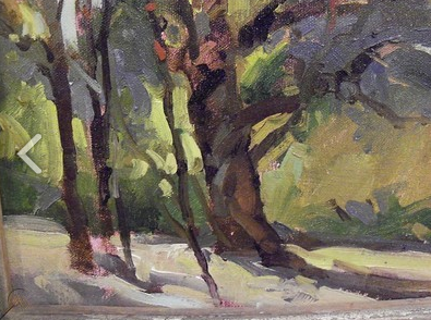
Detail
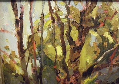
Detail

Misty Morning

My Valley
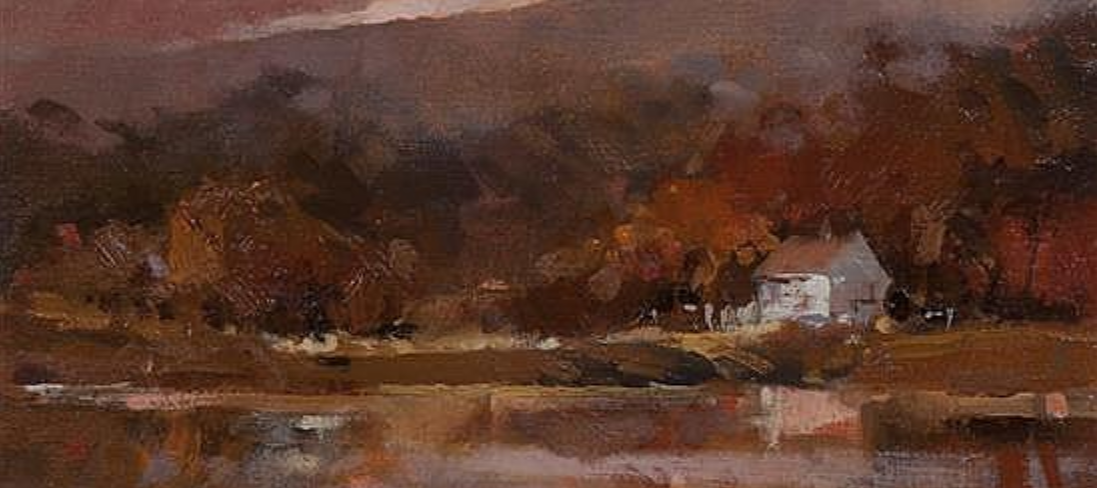
October Afternoon
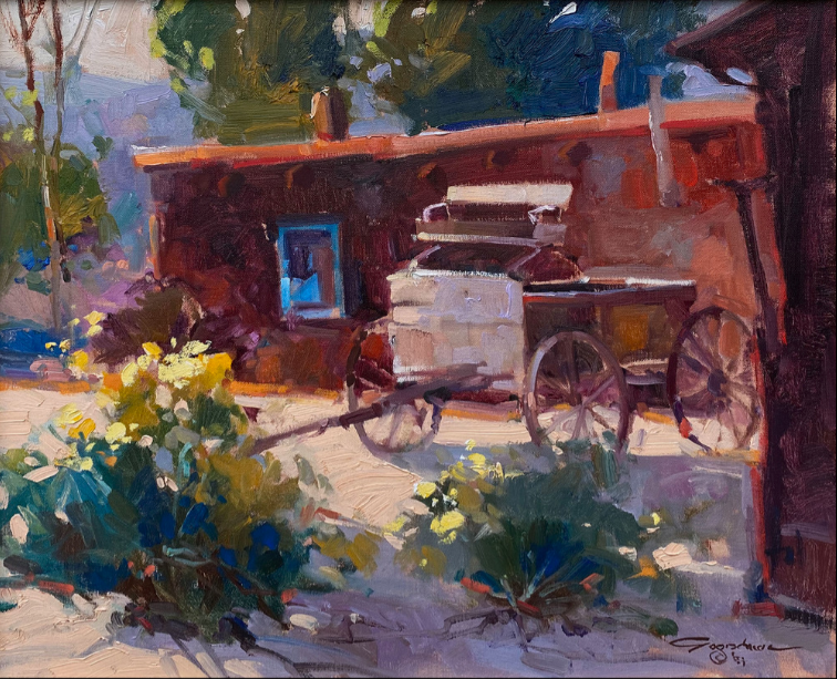
Old Wagon
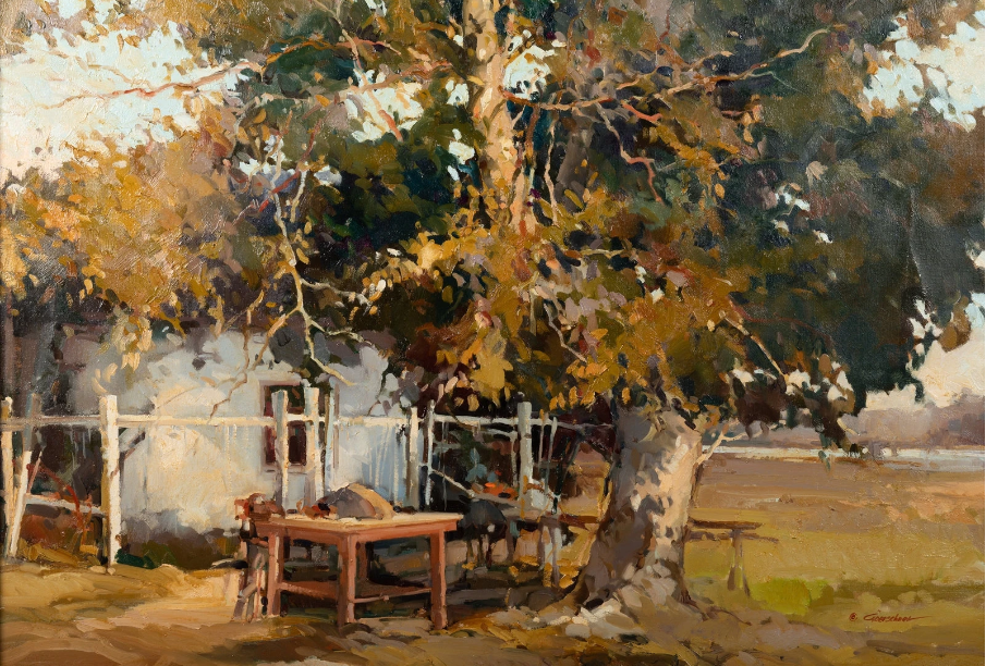
Retired Farm
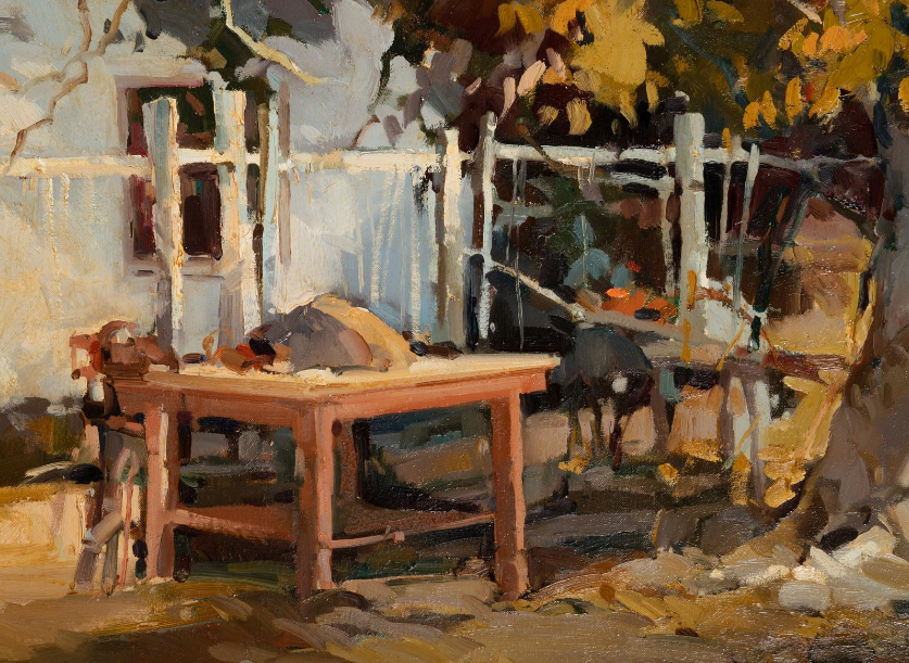
Detail

Snow on the Peaks
Summer

Summer River Landscape Detail
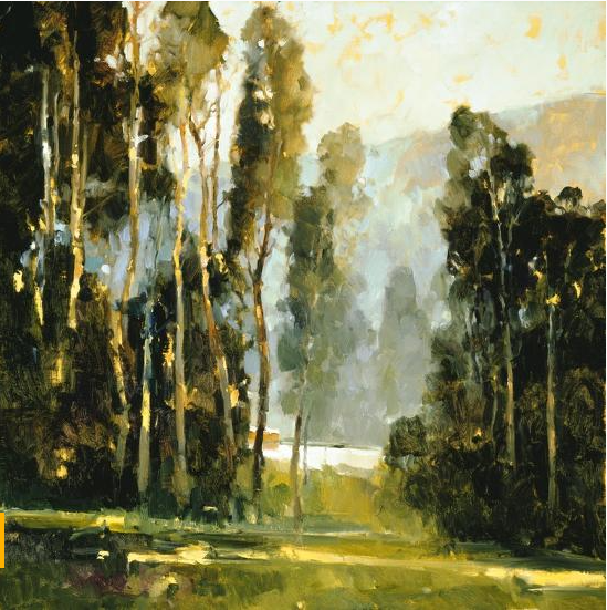
Sentine’s
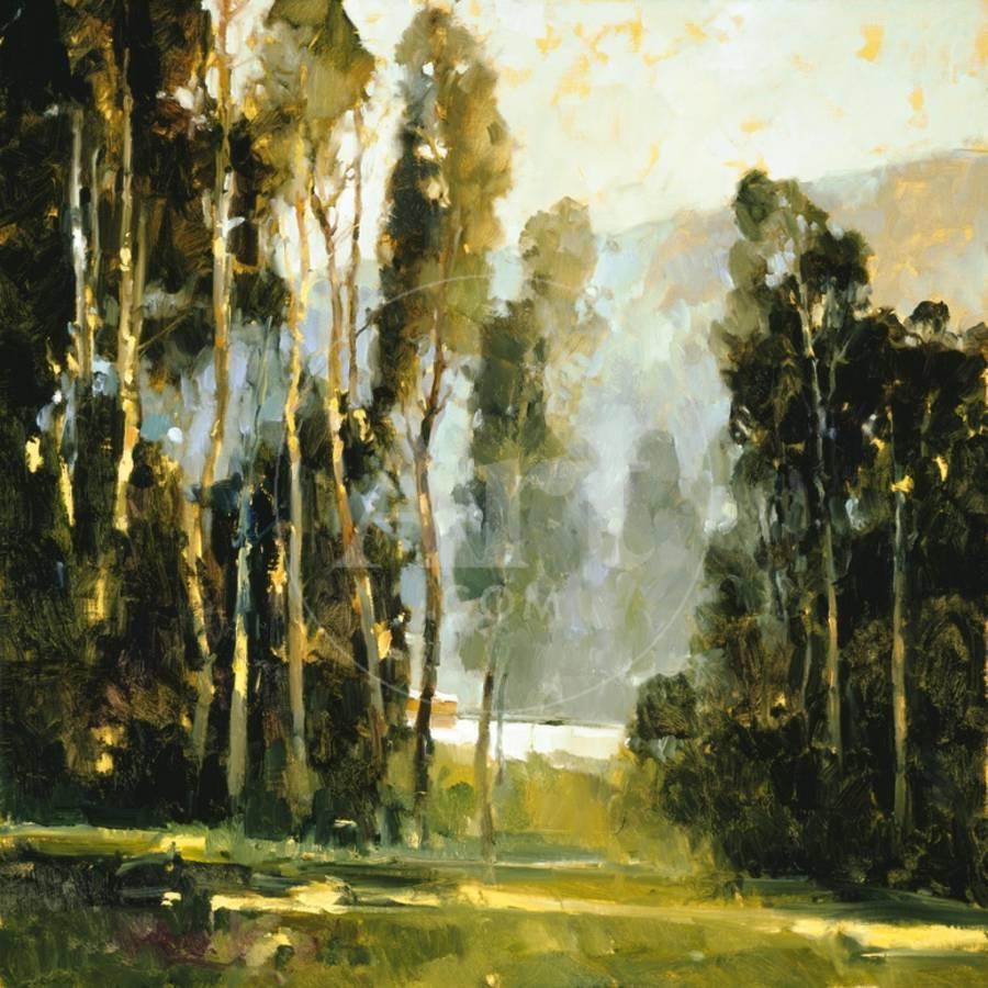
Detail

Carmel Mission

Cottage Reflection

Detail

Detail
Discover more from Jacki Kellum
Subscribe to get the latest posts sent to your email.