Are you trying to write your first picture book? It might be helpful if, very early in the process, you break your text into pages. Typically, there are 32 pages in a picture book, but the text of the book rarely begins on page one. Because the title page, endpapers, the dedication & the copyright page often precede the text, the story usually begins on about page 4 of 5. In this post, I’ll show you how to create a picture book text dummy. Unlike an illustrator’s dummy, a text dummy is for writers. You can put pictures in a text dummy, but that is not necessary. A text dummy is a way to plan your text. It will help you eliminate unnecessary words, and It will help you improve your book’s pacing–helping you understand where the page breaks should fall.

This post also looks at several different picture books. I show you that page 1 of a picture book’s text is never on the first page of the book.
Follow this link to see how to create a text dummy in Microsoft Word.
How to Create a Text Dummy for a Picture Book in Microsoft Word
Now, I’ll begin to explain some things about the structure of a picture book. I’ll begin with my own picture book The Donkey’s Song.

The Donkey’s Song
by Jacki Kellum
Illustrated by Sydney Hanson
Published by Doubleday for Young Readers
at Random House Children’s Books Here
Also on Amazon: Here
The Donkey’s Song has returned for another year, You can also purchase it at Cracker Barrel Restaurants this year.
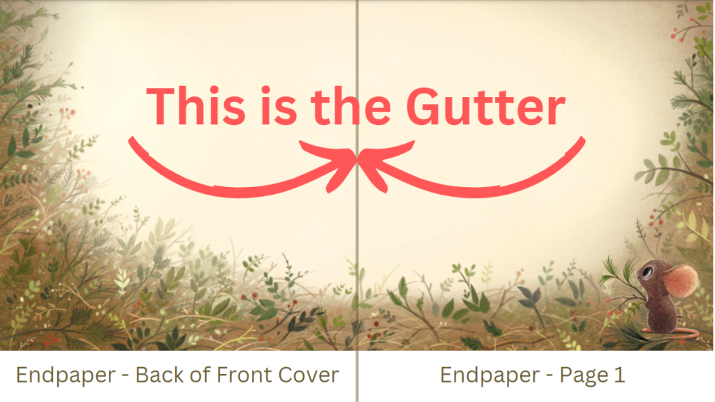
To break picture book structure into simple slices, every picture book that I have read [in book form] is meant to be viewed as two pages at a time. The two pages meet in the middle in an invisible but obvious gutter.
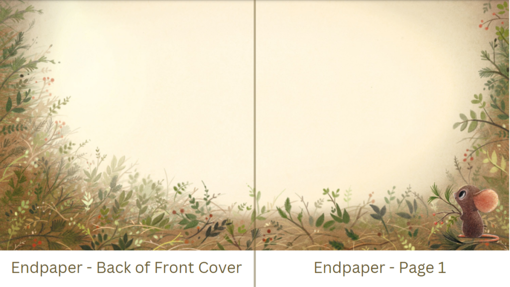
An endpaper normally faces the back of the front cover. Some of those endpapers are designed, and some are plain. Many endpapers are plain but colored. The endpapers of The Donkey’s Song are illustrated beautifully, and the illustration there foreshadows what will unfold in the book. It is on the endpaper that the illustrator Sydney Hanson begins telling her own version of the story. That is where she introduces the mouse. I didn’t write anything about a mouse in my manuscript. In a brilliant move by Sydney Hanson, the mouse is the second-most important character in “our” book. [This is not to take away from the character Baby Jesus, but Baby Jesus is not the main character in this book. It is the Donkey, who is telling the reader how Jesus’s birth affected him. It’s important to be honest about who the main character of your book is.]
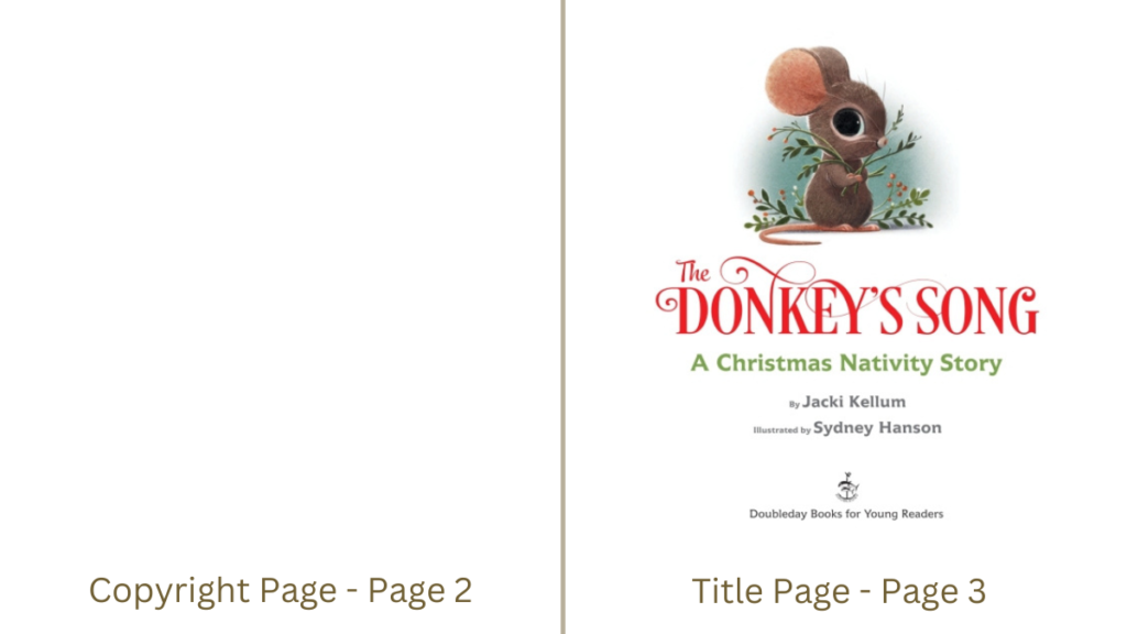
The text of The Donkey’s Song begins on page 5.
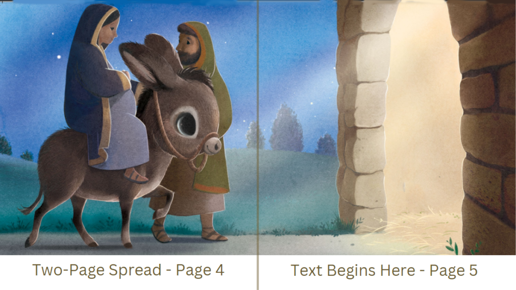
The following images give you some idea of how a picture book text dummy might look for a picture book that has text that begins on page 6.

The Donkey’s Song has 32 pages, and the final page of the book faces an endpaper. The final page of a picture book is often a quick aha moment. That is what happens on the final page of my book.
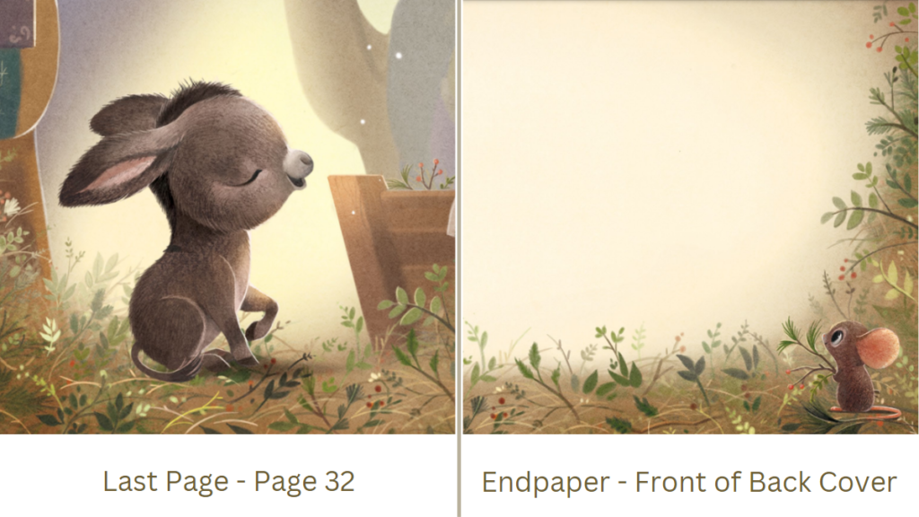
Somewhere along the way, I read that most picture books today have 32 pages, but I am discovering that is not at all true.
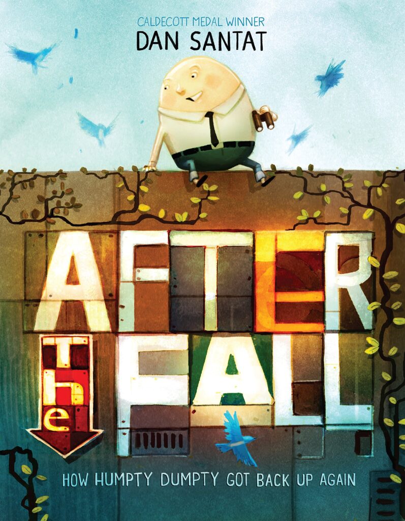
After the Fall has 36 pages, and I am discovering that several of the more modern picture books have 36 pages
After the Fall
Dan Santat
2017 Roaring Brook Press
357 Words
36 Pages
The following shows how the pages of After the Fall are laid out.

The text of After the Fall begins on page 5
The illustration on pages 4-5 is a two-page spread.

Again, the place where the book folds is called the Gutter.
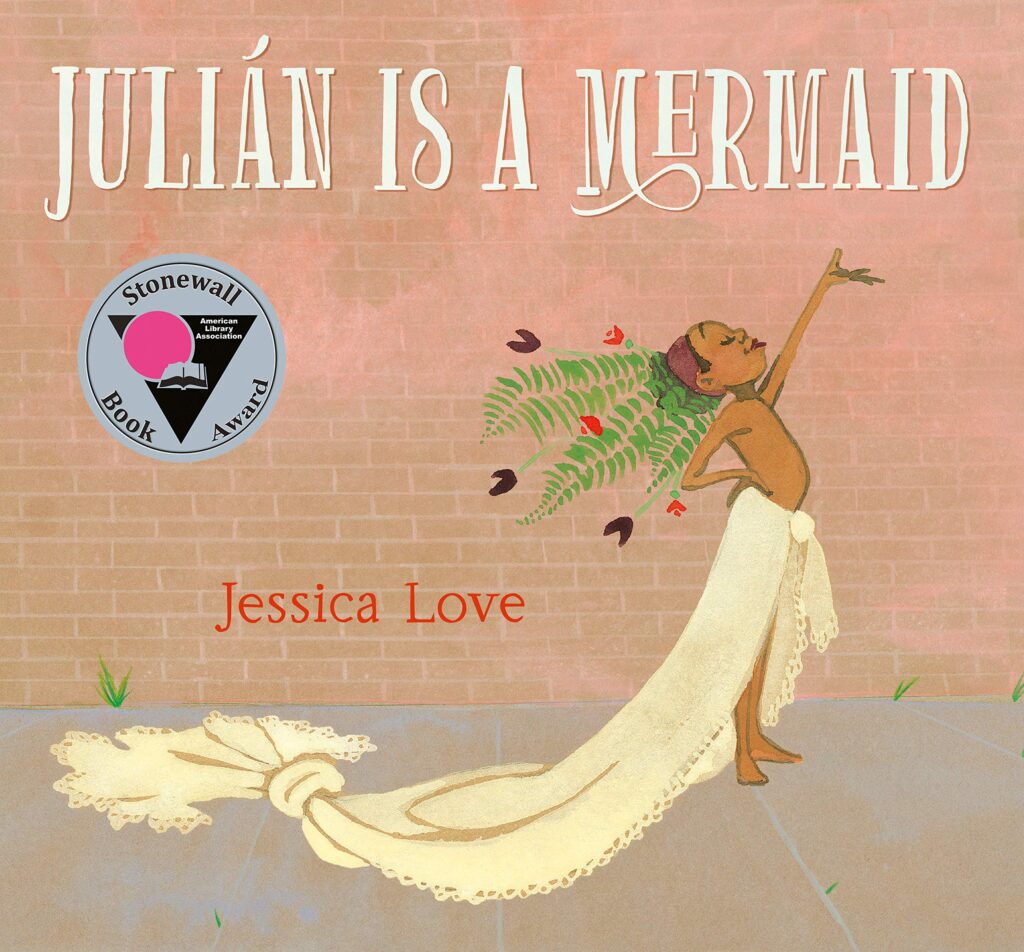
Julian Is A Mermaid also has 36 pages
Julian Is A Mermaid
Jessica Love
2018
83 Words
36 pages
Before I read Julilan Is a Mermaid, I was beginning to feel sheepish about how few words my picture books have. But I feel strongly about the fact that picture books should be just that–PICTURE books. I do not believe that picture books should be text-heavy. If anything, they should be picture-heavy. The Donkey’s Song has 186 words, but Julian Is A Mermaid only has 83 perfect and perfectly spaced words. And yet, those 83 words are spaced across 36 pages. Several of the spreads in Julian are wordless spreads. I love everything about Julian Is A Mermaid.
The text of Julian Is A Mermaid begins on page 4. Pages 4 and 5 have 2 individual illustrations. One illustration is in the middle of page 5. The illustration on page 5 does not spread to the gutter, but the illustration on page 6 does.

Because these two different illustrations on pages 5 and 6 are similar in color and tone, they work together as 2 facing pages. Jessica’s use of brown paper as a background unifies the illustrations on those 2 pages.

Several 2-page spreads of Julian Is A Mermaid have no text at all. On those pages, the illustration conveys the message of that page. Sydney Smith’s books have a lot of wordless pages, too. I also love everything about Sydney Smith’s books.
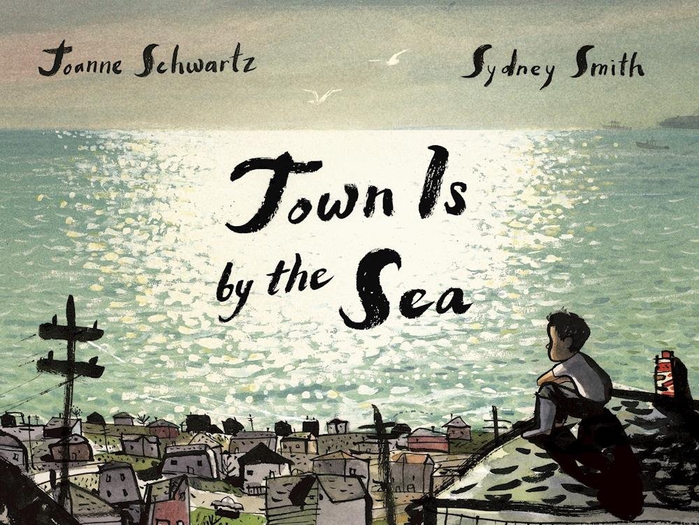
Town Is by the Sea
Joanne Schwartz
Illustrations by Sydney Smith
2017 Groundwood Books
614 Words
56 Pages
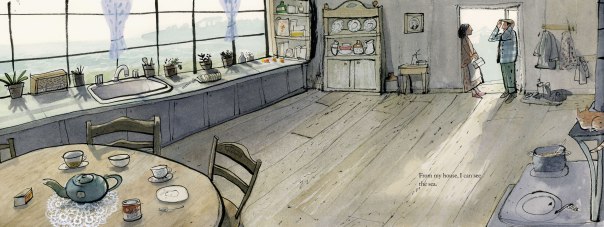
The above is a two-page spread that has only 1 illustration covering two pages in the book Town Is by the Sea.
This spread is where the text begins. The left side of the above image is page 6 of the book, and the right side of the image is page 7, where the text actually begins. The image spreads across both pages 6-7.

Notice that the text does not overwhelm the illustration. I like Smith’s books because they are true PICTURE books.
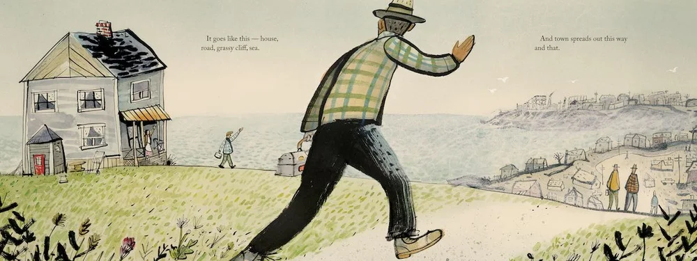
The two-page spread above is what appears on pages 8 and 9 of Town Is by the Sea. There is only a tiny bit of text on each page.
 The above images are on the two facing pages of page 10 and page 11, but I do not call this a spread illustration. Rather, the above shows two facing pages that have 2 different, individual illustrations on each side of the page.
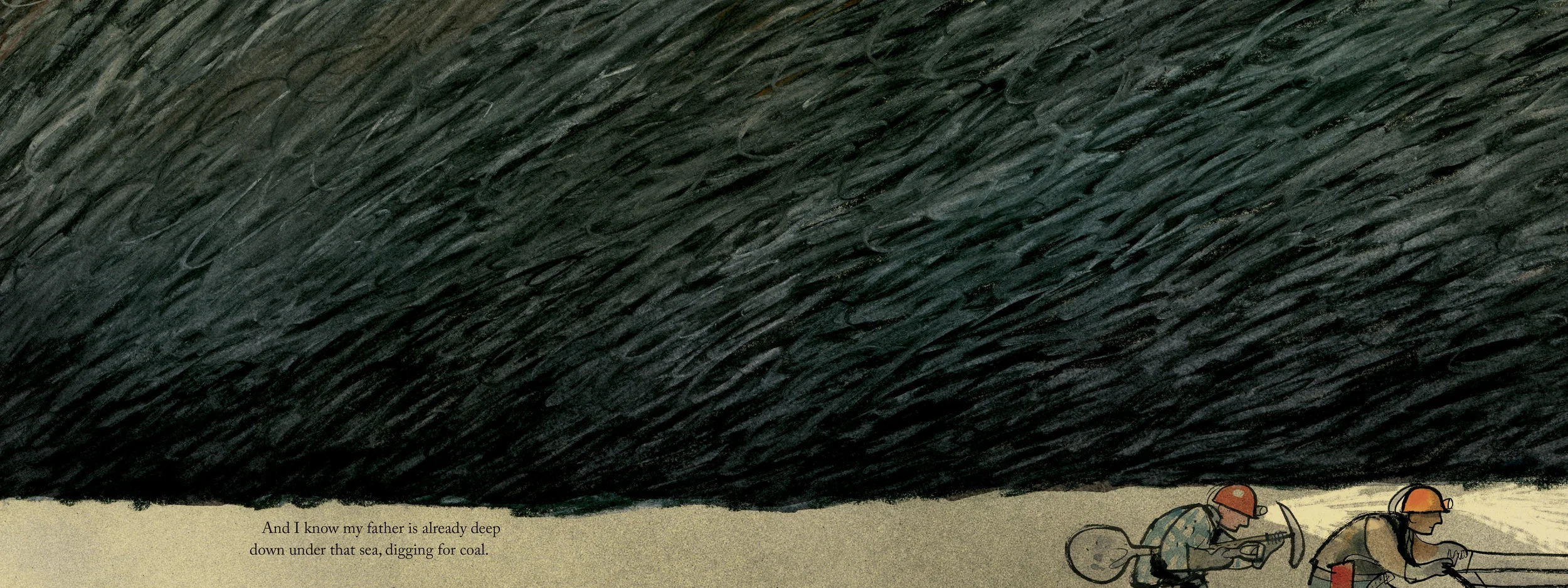
The above shows pages 16 – 17 of Town Is by the Sea. This is another two-page spread. One illustration covers two pages. Again, there is very little text on this spread. This ratio of text to image is consistent throughout the picture book Town Is by the Sea.
The above represents 2 facing pages with 4 illustrations. 2 illustrations are on one of the pages and 2 other illustrations are on the other page. There is no text at all on these two pages
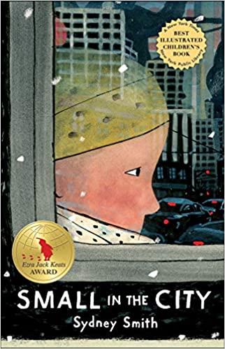
Small in the City
Sydney Smith
2019 Holiday House
302 Words
42 Pages
“Small in the City, the first book Smith has both written and illustrated, has been awarded the Society of Illustrators Silver Medal, and was named a New York Times/ New York Public Library Best Illustrated Children’s Book of 2019.”
I actually thought that the days of picture books with more than 32 pages were over, but I have recently enjoyed another picture book illustrated by Sydney Smith. Smith also wrote Small in the City, a picture book that has 42 pages. By today’s standards, 42 pages is an atypical number of pages for a picture book. But again, Small is not a tedious and wordy picture book. Small in the City only has 302 Words. [Where the Wild Things Are has more words than that.] Small in the City has a unique format in that those 302 words are spread over 42 pages. Several pages of Small in the City have no text at all.

The above is on two facing pages of Small Is in the City. These are the first two pages of book matter, but they appear on pages 6 and 7 of the picture book. There is still no text on pages 8 and 9.

The first words of text in Small in the City do not appear until page 10.
The illustration on pages 10 and 11 is a 2-page spread.

The above images represent those on about pages 36 and 37 of the book. Again, notice that there is no text here. Although these 4 images are the data that comprise two facing pages, I would not call these images a spread illustration. I may be wrong about this, but in my understanding, a spread image is 1 image that spreads across 2 facing pages.
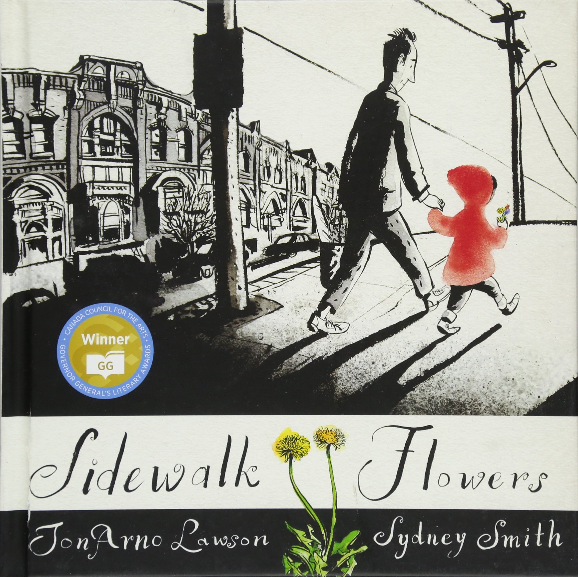
Sidewalk Flowers
JonArno Lawson
Illustrated by Sydney Smith
2015
A Kirkus Reviews Best Picture Book of the Year
A School Library Journal Best Picture Book of the Year
Finalist, Andersen Prize Books Without Words, 2021
An ALA Notable Children’s Book
A New York Public Library Best 100 Books for Reading and Sharing
“I’d give this book to anyone with a coffee table.” — New York Times
But here’s the deal about Smith’s Sidewalk Flowers. This unique picture book has no text at all.
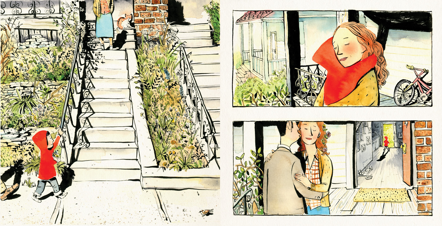

As you are preparing a text dummy for your picture book, ask yourself: “Do I need to actually SAY this or that–or can an illustration show what I might otherwise tell?”
Before the 21st Century, several picture books had 42 or more pages.

Little House – Virginia Lee Burton – 1942
Caldecott Medal
Book #32 out of 100 Best Picture Books [of almost forever] – School Library Journal
44 Pages

Animals of the Bible: A Picture Book
1937
Caldecott Medal
72 Pages
The First Caldecott Medal Was Awarded to Animals of the Bible: A Picture Book by Dorothy P. Lathrop That Was Published in 1937.
Animals of the Bible has 72 pages, and it bears little resemblance to today’s picture books. It has a Table of Contents and a Foreword. The first page of text is on page 7.

I agree that the illustrations for Animals of the Bible are fabulous pin-and-ink drawings, but they do not look like many of the illustrations in today’s picture books.
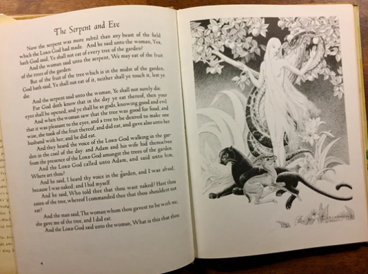
Before I move forward, I want to say that I do not like picture books that have huge blocks of text–ANYWHERE.
Most of the illustrations for Animals of the Bible are on one side of a page, with a wordy block of text on the opposite side. Wordy is the operative word here. In my opinion, Animals of the Bible has TOOOO many words. But this book illustrates the fact that trends in picture books change.
But there are a few spread illustrations in the book that cover both of the facing pages.

Let’s take another look at Sydney Smith.

The image above is one side of the following 2-page spread:

Town Is by the Sea has 614 Words, but Town Is by the Sea manages the text so that it does not overwhelm the illustration.
Great Picture Books CAN Have Lots of Words
But ONLY if they are placed well on the pages.
I maintain that the text should never overtake the illustration.
Discover more from Jacki Kellum
Subscribe to get the latest posts sent to your email.